Wix Design Trends in 2025: Stunning Website Examples & How to Implement Them

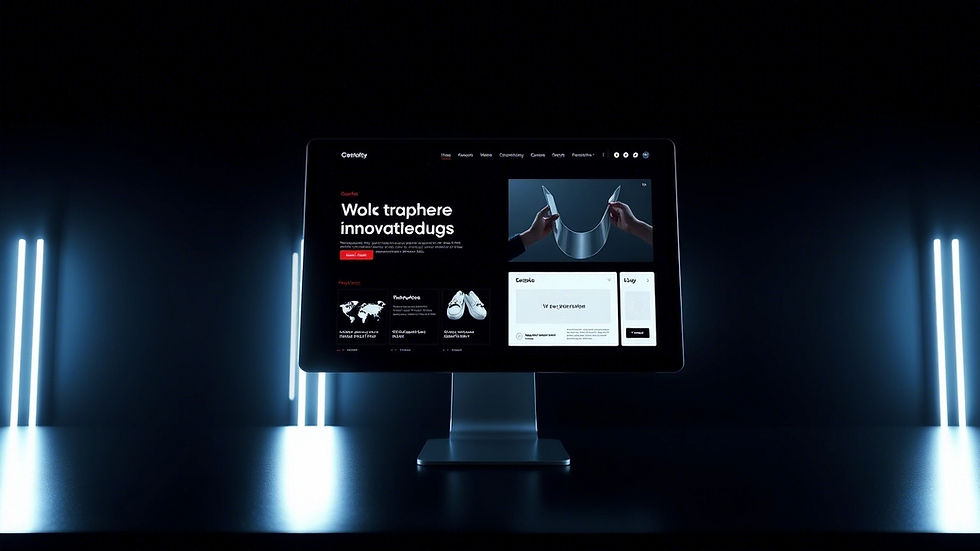
In the ever-evolving world of web design, staying on top of the latest trends is crucial to making your website stand out. In 2025, Wix users are embracing innovative aesthetics and functionality to create visually compelling sites that not only captivate visitors but also drive conversions. In this post, we explore seven key design trends—from minimalism to micro-interactions—that are shaping Wix websites this year. We’ll showcase real-world examples and provide actionable tips on how to recreate these trends using Wix’s powerful design tools.
1. Minimalism
Overview:
Minimalism continues to be a favorite trend as it emphasizes clean layouts, ample white space, and simple, impactful content. This design approach helps users focus on the essentials while delivering a modern, uncluttered experience.
Example:
Imagine a Wix site that features a single, bold headline, a few high-quality images, and clear calls-to-action, all set against a white or neutral background.
How to Implement on Wix:
Use the Wix Editor to select a minimalist template.
Prioritize essential content and remove unnecessary elements.
Utilize white space and simple typography to enhance readability.
2. Dark Mode
Overview:
Dark mode isn’t just about aesthetics—it also reduces eye strain and can create a sleek, contemporary look. Many modern websites now offer a dark-themed version to improve user experience in low-light environments.
Example:
A Wix site with a dark background paired with vibrant accent colors and striking imagery can provide a dramatic and immersive experience.
How to Implement on Wix:
Choose a dark-themed template or customize your site's background using Wix’s design tools.
Adjust text and button colors to ensure high contrast and readability.
Experiment with gradients and subtle shadows to add depth.
3. Brutalism
Overview:
Brutalism in web design is all about raw, unpolished aesthetics. It features bold typography, stark color contrasts, and a no-frills layout that challenges conventional design norms.
Example:
Consider a Wix website that uses blocky layouts, asymmetrical elements, and a mix of harsh colors with strong, impactful fonts to create an edgy, modern vibe.
How to Implement on Wix:
Utilize Wix’s drag-and-drop features to create unconventional, grid-free layouts.
Experiment with bold fonts and contrasting color schemes.
Don’t be afraid to break traditional design rules—embrace the raw and unapologetic look.
4. Neumorphism
Overview:
Neumorphism blends minimalism with subtle 3D effects, using soft shadows and gradients to create interfaces that appear tactile and lifelike. This trend offers a fresh twist on traditional flat design.
Example:
A Wix site featuring buttons and cards with gentle, inset shadows and light gradients can achieve a sophisticated, almost tangible look.
How to Implement on Wix:
Use Wix’s built-in design tools to add soft shadows and gradients to elements.
Maintain a consistent color palette that complements the neumorphic effect.
Balance this style with plenty of white space to prevent the design from feeling too heavy.
5. Bold Typography
Overview:
Bold typography has become a powerful design statement. Oversized, eye-catching fonts can immediately capture attention and convey a brand’s personality.
Example:
Imagine a Wix homepage where a striking, bold headline dominates the screen, paired with minimalist imagery that lets the typography speak for itself.
How to Implement on Wix:
Select custom fonts from the Wix Editor that align with your brand’s voice.
Use large font sizes for headlines and key messages.
Ensure text is legible by testing different weight and color combinations against your background.
6. Asymmetrical Layouts
Overview:
Breaking away from traditional grid systems, asymmetrical layouts create a dynamic and engaging user experience. This approach leads to unexpected compositions that keep visitors intrigued.
Example:
A Wix website might feature unevenly distributed content blocks, overlapping images, and text elements that create a sense of movement and visual interest.
How to Implement on Wix:
Use the Wix drag-and-drop editor to position elements in non-uniform ways.
Experiment with overlapping sections and varied column widths.
Keep the overall design balanced by ensuring that no single section overwhelms the others.
7. Micro-Interactions
Overview:
Micro-interactions are subtle animations or effects that occur when users interact with your site. These can enhance user engagement by providing visual feedback, making the browsing experience more enjoyable.
Example:
A Wix site with buttons that change color on hover, animated icons, or slight movements when scrolling can create a more interactive and polished user experience.
How to Implement on Wix:
Utilize Wix’s animation settings to add hover effects and transitions to elements.
Integrate interactive features such as clickable image galleries or animated call-to-action buttons.
Test the interactions on different devices to ensure smooth performance.
Conclusion
The design trends outlined above represent just a snapshot of the innovative aesthetics transforming Wix websites in 2025. By incorporating elements like minimalism, dark mode, brutalism, neumorphism, bold typography, asymmetrical layouts, and micro-interactions, you can create a website that not only looks stunning but also delivers an exceptional user experience.
Wix’s intuitive design tools make it easier than ever to experiment with these trends and tailor them to your brand’s unique identity. Whether you’re refreshing an existing site or building a new one from scratch, now is the perfect time to leverage these trends and set your website apart in 2025.
Pro Tip
Stay ahead of the curve by scheduling regular design reviews to assess emerging trends and update your site's aesthetics. Investing a little time each quarter in refreshing your design can make a huge difference in user engagement and conversion rates.
Need expert guidance?
At UX Chiefs, we specialize in creating stunning, trend-forward websites on Wix. If you're looking to implement these design trends or need a complete website makeover, our team is here to help. Contact UX Chiefs today for a free consultation and let us transform your online presence with the latest design innovations.


Xu hướng nào rồi cũng trôi nhanh, nên điều mình thấy thú vị là cách bài chọn ví dụ cụ thể thay vì chỉ nói chung chung về mặt hình thức. Mình đang xem qua vài mẫu trang để hình dung bố cục cho một dự án cá nhân, và thấy các xu hướng về chuyển động, khoảng trắng hay nội dung do người dùng tạo thường chỉ có ý nghĩa khi hợp với nội dung thật. Go88 từng được một người quen nhắc trong lúc mình nói chuyện về các trò chơi trực tuyến, nhưng mình không đi sâu, nên cũng không đánh giá gì thêm. Bài này đủ để mình nhớ rằng phong cách đẹp vẫn cần đi cùng…
Mình không làm nghề thiết kế, nhưng đọc tới phần nhắc xu hướng bố cục và minh họa thì nhớ hồi còn làm slide cho câu lạc bộ ở phường. Hồi đó đứa bạn ngồi cạnh mình có mở cho xem vài trò chơi killing time, trong đó có nhắc tới go88, mình chỉ nghe thoáng qua rồi quên mất nội dung. Bài này liệt kê khá nhiều ví dụ, điều đó hữu ích với người xem, còn phần cách triển khai thì mình thấy cần ví dụ chi tiết hơn mới hình dung được.
Mục xu hướng thiết kế Wix năm 2025 đọc thú vị vì nó bám theo thứ đang thực sự xuất hiện, không phải kiểu dự đoán chung chung. Phần bố cục nhiều khoảng thở, nền tối, hiệu ứng cuộn mượt đều quen thuộc vì tôi vô tình gặp hằng ngày trên mạng, nhưng ít ai chỉ ra vì sao những thứ đó lại phổ biến. Cách tách phần mô tả xu hướng và phần tự làm theo từng bước cũng hợp lý, vì nhiều khi ta chỉ ghi nhận phong cách mà không biết kỹ thuật bám theo. Nếu hình ảnh đính kèm nhiều ví dụ cụ thể hơn thì tốt hơn. Tối hôm đó có người gửi một đường…
Xem các ví dụ trong bài khiến mình nhớ hôm trước lướt giao diện trên điện thoại lúc đang pha cà phê, khá chậm nên chỉ đọc được phần đầu rồi để dành. Trong lúc chờ nước sôi, mình tình cờ mở sang tab có go88 vì từng nghe vài người bàn về game bài đổi thưởng, xong lại quay lại bài và tự hỏi các xu hướng kể trên có thật sự dễ áp dụng cho một người không làm nghề thiết kế hay không.
What interests me about choosing a college learning environment is how a broad idea becomes part of an ordinary day. The way a course is taught can affect whether a student feels comfortable asking for help. I would keep that thought nearby when looking for ideas about college study choices. I do not have a settled view yet, but this seems like a good place to slow down and look more closely. What would you ask about teaching and support before choosing a college?